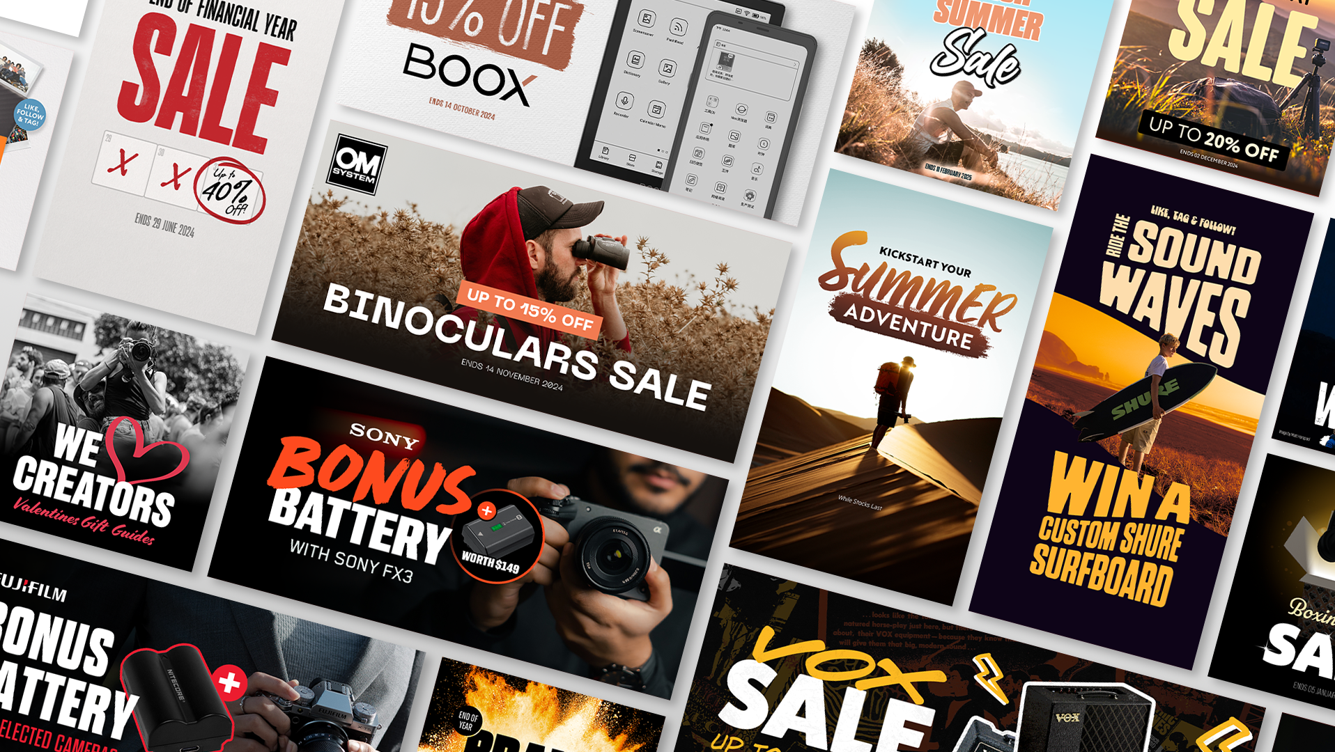
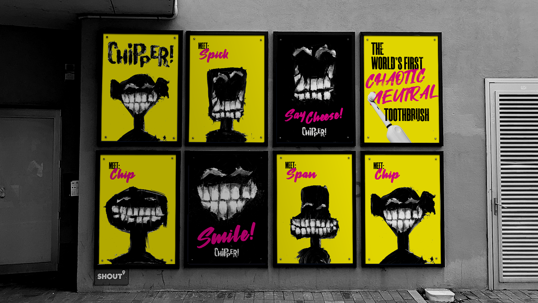
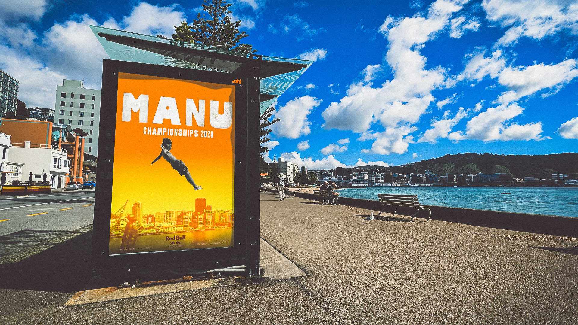
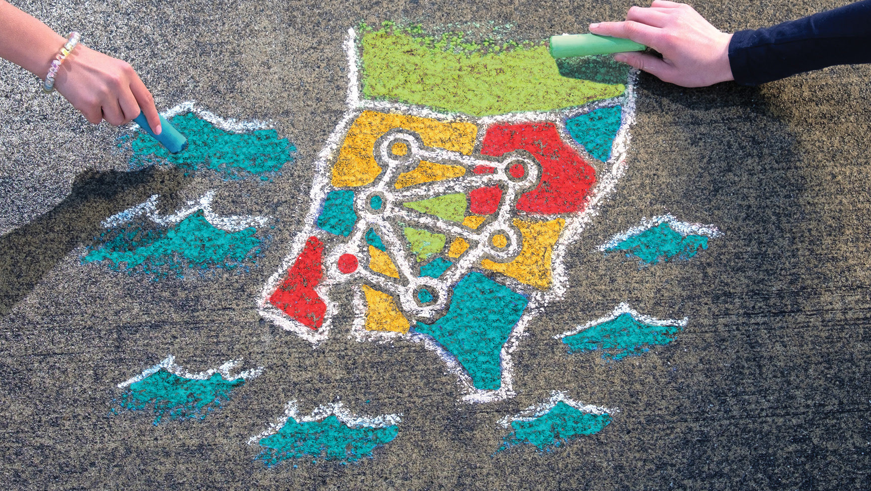
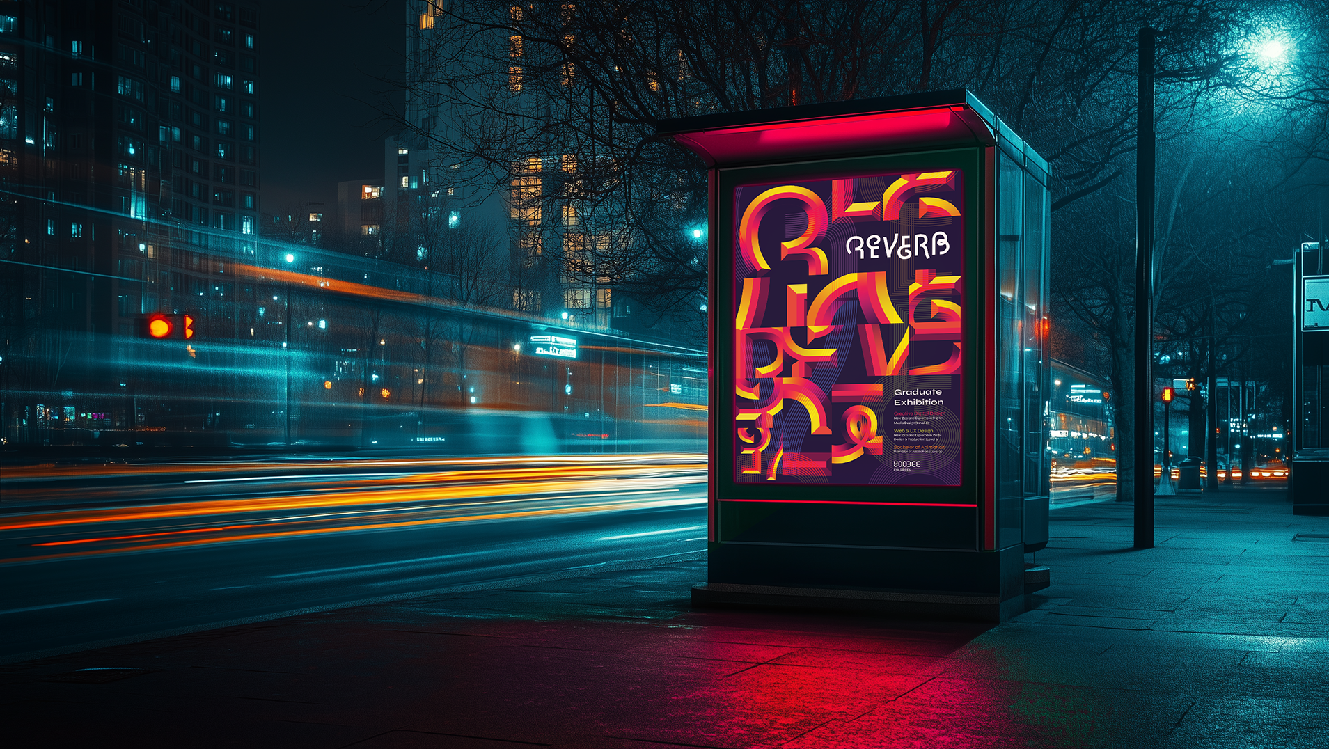
At Rubber Monkey I had an ongoing task to continually updating the existing branding.
The brief was simple: enhance and expand the the branding with a focus on increasing usability and flexibility.
The only restriction? Don't remove or heavily alter the monkey illustration.


Above are the original assets I started with.
The project was an exercise in maintaining the essence of the brand, while creating something with more use cases. I started by cropping the monkey to let the wordmark fit more snugly alongside it, and created a separate typographic design for the tagline.
To further build off the Monkey character, I created a series of themed illustrations based on seasons, promotional events, or categories of products Rubber Monkey sells.

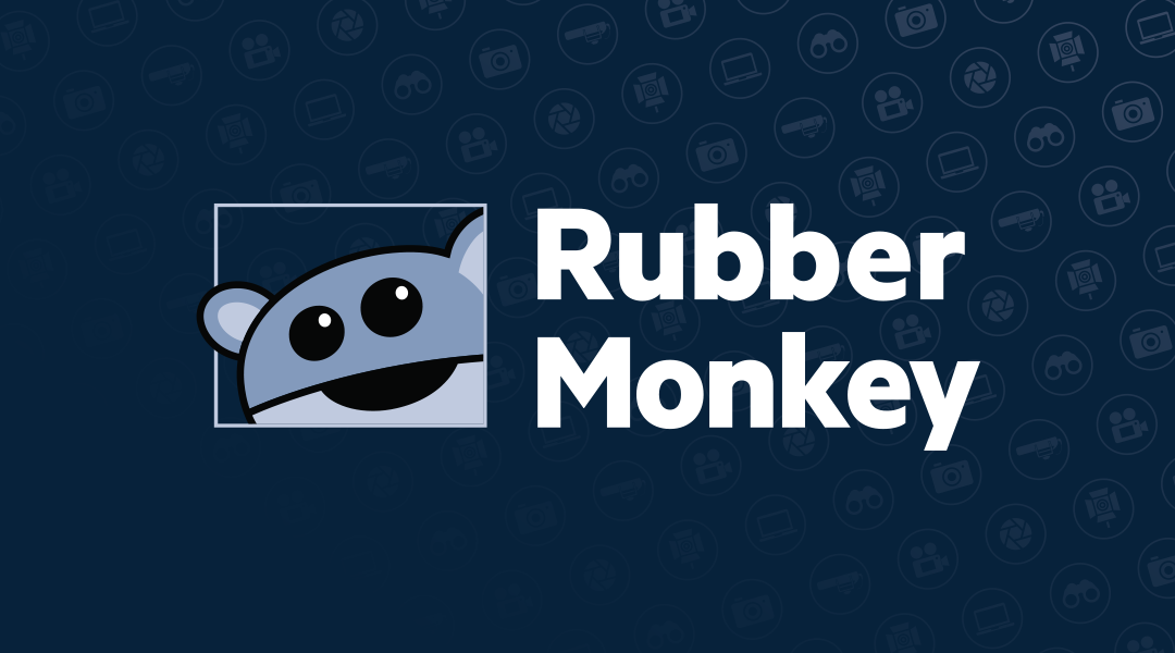
There also weren't a lot of visual indicators of what products Rubber Monkey sold, so I also made a suite of icons that could be used individually or as a pattern. This added a much needed secondary element for the main logo to be paired with.
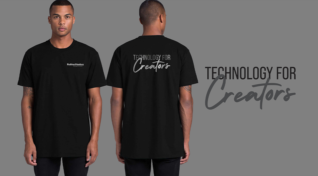
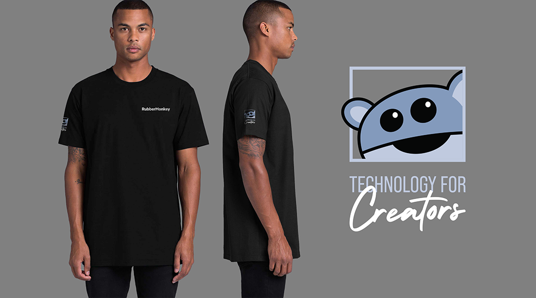
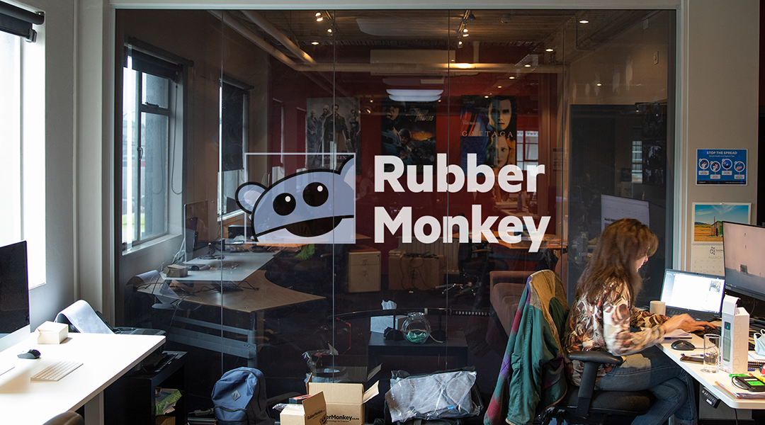
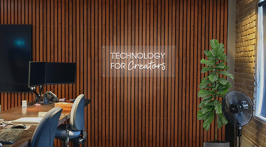
I also developed merchandise, clothing and several installations and prints for Rubber Monkey's Wellington and Sydney office.
